Blue Skin – Shotgun Cubs [OFFICIAL MUSIC VIDEO]
August 10, 2014
This was my graduating project for my media degree at the University of Canberra last year. Thanks to a really supportive and talented team, I’m proud to post the official music video for Blue Skin by the Shotgun Cubs – a talented Canberra duo. My role on the project was producer, director, designer and editor. Enjoy! x
Blue Skin – Shotgun Cubs [OFFICIAL MUSIC VIDEO]

Lucky Ang Love
February 24, 2013
Siew Tin, a 73 year old Malaysian woman, retells the story of the love of her life and the cultural boundaries they struggled against in order to be together.
A documentary made in 2012.
PAINT
October 3, 2012
This is a process documentary that I made for my Documentary Production unit at the University of Canberra. It had to demonstrate all the crucial features of a process without dialogue or headings, and it had to be exactly 4 minutes.
India: in photos
July 26, 2012
Recently I went to India for 7 weeks, 4 of which I spent in Mumbai studying Bollywood and Indian cinema.
It was the most amazing, inspiring and mind broadening experience.
Here are some photos.

A wall just beyond our breakfast area in Andheri West, Mumbai.

It was hilarious.

Alkira.

Jane.

Meeting Vikas Bahl, director of Chillar Party (2011).

The traffic was ridiculous and brightly coloured, and the trucks were all painted like hippy vans.

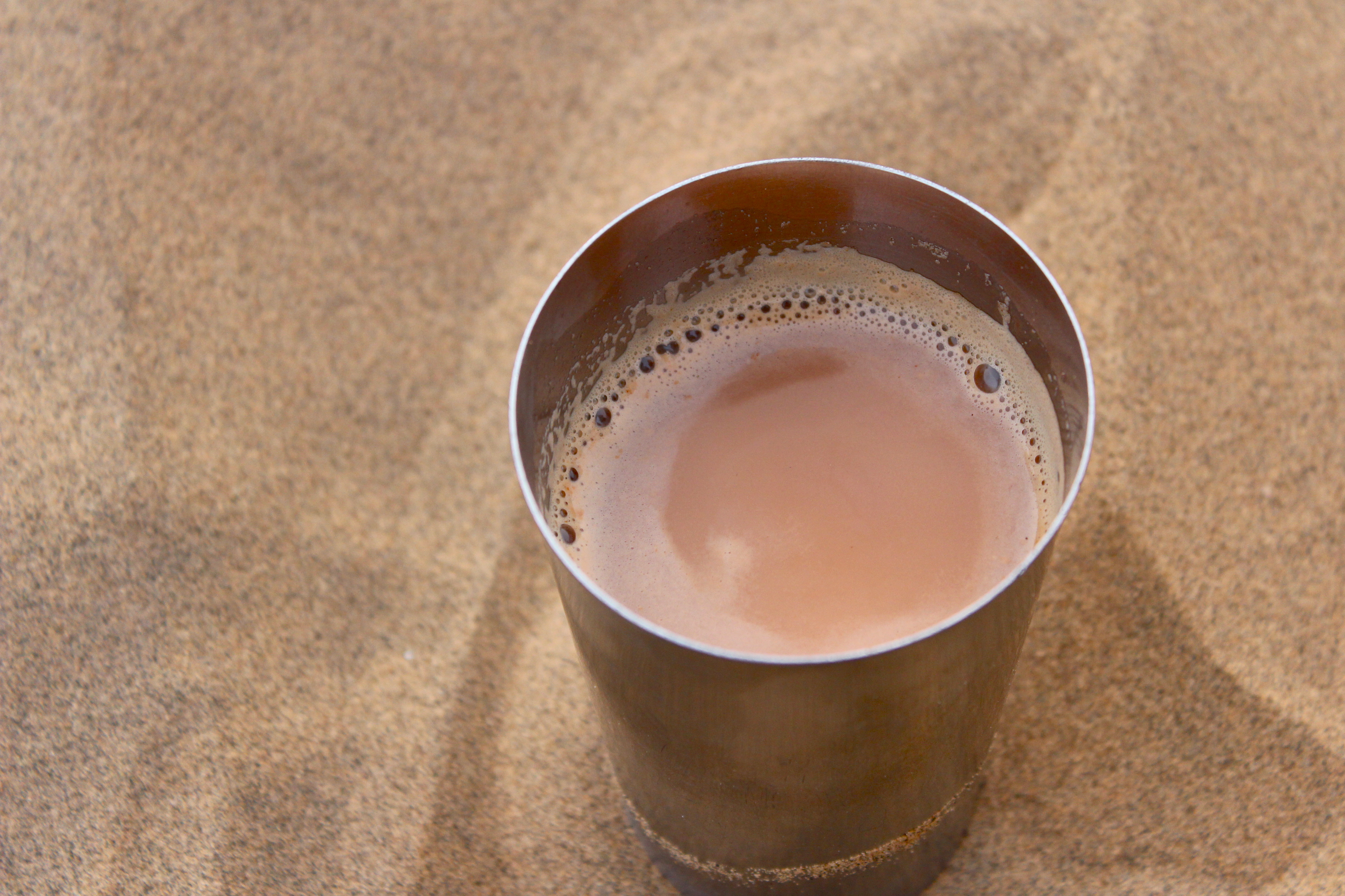
Chai: we lived off the stuff. Add Masala tea, fresh ginger and water. Bring to the boil. Add milk and copious amounts of sugar. Bring to the boil again and then let simmer. Serve.

Josh.

Stairway to the unknown?

Beautiful clouds in Malawali, India.

Making a cucumber masala snack for energy up the fort.

Josh and I made some friends and shortcut gurus en route to Iron Fort.

The view!

Iron Fort’s Scorpion Tail.

Woo!

Our snack break halfway down as we waited for the rains to ease.

Film.

Real film!

A rickshaw meter.

Mumbai after rain. Pretty.

Nasreen at a school in the Bandra slums.

Henna.

Our rickshaw driver/actor.

An old lady sleeping on a train as she shares her seat with 2 others.

The Magnificent Taj Mahal.

.

.

From our hostel window.

Sam.

.

Jaipur.

Riding an elephant. Yeah.

Josh.

Tali

Jodhpur.

Lewie getting ripped off by a cold, old man at Jodhpur fort.

Night-time Traffic.

One of the more comfortable train rides.

The view from our hostel roof in Jodhpur.

Chilling on the roof is very common.

.

.

Our dinner view: The Jodhpur Fort lit up.

Kool Koko, endorsed by Lewis Matherson.

Alternative to Pooh Corner.

View from Jodhpur Fort. BATMAN WAS PARTLY FILMED HERE!!!!!!! No giant pit of despair though.

Jodhpur: The Blue City. The blue originally started with a religious cloister that believed that it was a holy colour and painted all of their buildings blue. As they became less segregated, other parts of the city adopted the blue colour. Turns out something in the paint is a natural mosquito repellent.

.

.

.

.

.

Another Lewis Matherson endorsement.

.

Beautiful clouds.

Cows walkin’ along the street.

.

Camel safari from Jaisalmer, Rajasthan.

Johnny the Camel: Glamour Files.

.

.

Stunning eyelashes.

.

.

.

.

Jane and some village desert kids.

.

Beautiful goat.

.

.

.

.

.

.

The boys.

Jane doing the Desert Worm.

.

The boys chilling as the sun sets over the sand dunes.
Desert Chai.

Something woke me up just before dawn (normally unheard of). It was so peaceful.

Lovely desert flowers.

.

Lewie and some village kiddies.

.

Sam’s camel loved him a little too much…

.

.
.

Yellow coconuts are apparently a different variety to the normal young green ones. They are yummy and super sweet.

Lighthouse Beach in Kovalam, Kerala. It reminds me of Where the Wild Things Are.

.

.
On the way up the lighthouse. Windy as!

Lighthouse Beach.

.

Some Indian tourists wanted to get photos with us.

Window to the sea.

.

.

.

.

.

.

Josh got really into musicals while in India (Cats especially) and put on a one man show.

Lighthouse beach by night.

House boooooooat in Alleppey. Captain Josh and the Going Merry.

.

.

.

.

Lunch aboard Merry.

Goats chilling in Fort Kochi. I got to ride on the back of the owners bike to go and buy Jane’s emergency birthday cake.

This goat reminds me so much of a chicken. Who knew goats sat this way???

.

The view from the top of a ruined fort in Goa.

We hired fun little scooters to explore Goa, and some psycho Portuguese Australian claiming to be from Master-Chef Australia tried to scam us, and then come after us with a mob of Goans. Scooters are great escape vessels!

The view from our top floor room at the Taj Palace in Mumbai.

The lobby. FANCY!
“Only a fearless mind can make an honest film.”
-Vivek Agnihotri (Director of Buddha in a Traffic Jam)
Meta Post
May 20, 2010
Now that I’ve come to the end of my first semester at UNI, and I finally have time to take a proper breath, I can fully appreciate all that I’ve learnt and been exposed to these past few months. I took three classes this semester and with two being media related, it is little wonder that my awareness of media, and my definition of media have been blown wide open.
Not only have I found myself repeating interesting tidbits of information from lectures and my own research to my long suffering friends and family, but I have managed to maintain a blog, keep up to date with multiple sources via Google Reader, write, design and code a website, and design a data visualisation.
Awareness. Media is everywhere. Computers, radios, televisions, posters, books, magazines, phones, cameras… most of us carry a media device on us all the time, and an even greater proportion would consult a media device on a daily basis.
It is always leaping forward. Soon 3D media will be commonplace, as will cross media production which, incidentally, is a great way to circumvent media piracy. Cross media production (if I have my terms right) is when a program is aired/published in several different formats, but in order to get the full story, you have to look at all of them. In invites audience participation which has already proven hugely successful. People can produce their own media now and so want and expect more from companies that want money for it. ARG’s are becoming ever increasingly popular and I have to say, I’m tempted to try one.
Do you know how many blogs are out there? (Over 50 million) How easy it is now to send a message to huge numbers compared to a hundred years ago? (Amazingly so) Compared to fifty years ago? (Very) Or what a great resource the internet is? (Such a great resource) It is the treasury of the collective human intelligence. And that’s an amazing thing.
Before taking this course I was hardly aware of any of this.
And I never thought I’d have a blog. Yet here I am, a tiny piece of this huge puzzle offering some thoughts up to the world in a way that was never possible before.
This media explosion has happened in such a short space of time, that it really makes me wonder what will come next? Because, without a doubt, something even more amazing will.
It also makes me wonder how, with such technological advances, so many people are starving and in poverty. I know other issues take up a lot of international attention, but surely more could be done.
Anyway, onto my blog. I got quite into the whole ‘blogging’ thing, regularly writing extra posts. The tricky thing I found was not blurting too much of my personal life out. I’ve got to remember that blogs are not diaries! Other people read blogs. Blogs are a way to send messages to lots of people, and if you’re comfortable enough to invite people to read your diary, then great. But I, unfortunately, am not.
I saw in another persons blog that they’d set up something at the start of the semester so they were able to publish their blog traffic statistics. I was not so clever and tried to copy and paste the graphs that I can see (as an administrator, or whatever) into this post, but no luck. So I used onlinecharttool again with my blog traffic data, and came up with these fascinating creations…


It seems my busiest month was March with 72 views, my busiest week was Week 14 with 38 views and my busiest day was the 25th of March with 14 views. In total, as I write this post, my blog has had 212 views (not including mine!), 23 posts, 6 comments and the following referrals!!

I’m pretty impressed with my total number of views. For a first time blogger, and with this being an assignment blog, I’m delighted. I may even keep up the blog for semester two (I don’t know if it’s a requirement yet). I, a 19 year old UNI student have been able to communicate with an unknown number of people 212 times!
Content wise, I think I’ve definitely filled the criteria concerning discussing and developing my assignments. However, I probably should have paid more attention to current media issues such as the censorship debate and the google van picking up peoples internet usage. I discovered onlinecharttool, but that’s really the extent of ‘websites I’ve discovered’.

Aside from the obvious downside to onlinecharttool (it doesn’t resize to accommodate your labels), this graph shows how many views each post got. I arranged the posts in publication order. The statistic missing from this graph is the number of views the website got. Clearly, if someone just typed in http://www.mog2010.wordpress.com, it wouldn’t register on any of the posts. But I can tell you. The number of homepage views was 140. This makes me think my classmates must be using an RSS feed too, given the other numbers.
The three posts I am nominating are :
If I had the time to go back and re-write some of my posts, I’d put more effort into discussing up and coming work and interesting websites I’ve found. However, there is my selection.
What a great semester.
The ‘B’ Project
May 14, 2010
I began project B somewhat cautiously, as both options sounded intriguing yet challenging to produce to the required standard. Eventually, I decided on creating a data visualisation of some educational data my dad’s work gathered in the Solomon Islands. At this point, I was under the impression we would actually be making the visualisation using Flash, so on some level I hoped I would be helping the education battle by revealing astonishing findings. Alas, and thankfully, I discovered that we only needed to come up with the concept, as we lacked the skills to actually build a datavisualisation.
After some initial brainstorming, drama erupted with my discovering that I didn’t have ALL the required data, so I cut my losses and went in search of a new, interesting and complete data set. I thought if I couldn’t help humankind, I could at least come up with some quirky data and funny correlations. I tried searching google for ‘funny statistics’ and ‘quirky data sets’ but nothing usable turned up. I changed track, considered which issues concerned your average Australian and had a search on the Australian Bureau of Statistics website. I decided on a Mental health survey in the end. Mental Health is such an important issue as it concerns a huge number of Australians and also a lot of people I love.
I thought about how I could visualise this data and what the characterising aspects of a data visualisation were as opposed to an infographic and how I would adopt them in my visualisation. I decided that one of the most important aspects of a data visualisation was its potential to be a democratic tool. A data visualisation takes raw, and therefore potentially useless information, and translates it into a form that your average person can understand. Focusing on this concept, I decided that I wanted the viewer to have total control over how they viewed the data and over how much detail they viewed at once. This is closely related to another characteristic which separates a data visualisation from an infographic: it’s interactive.
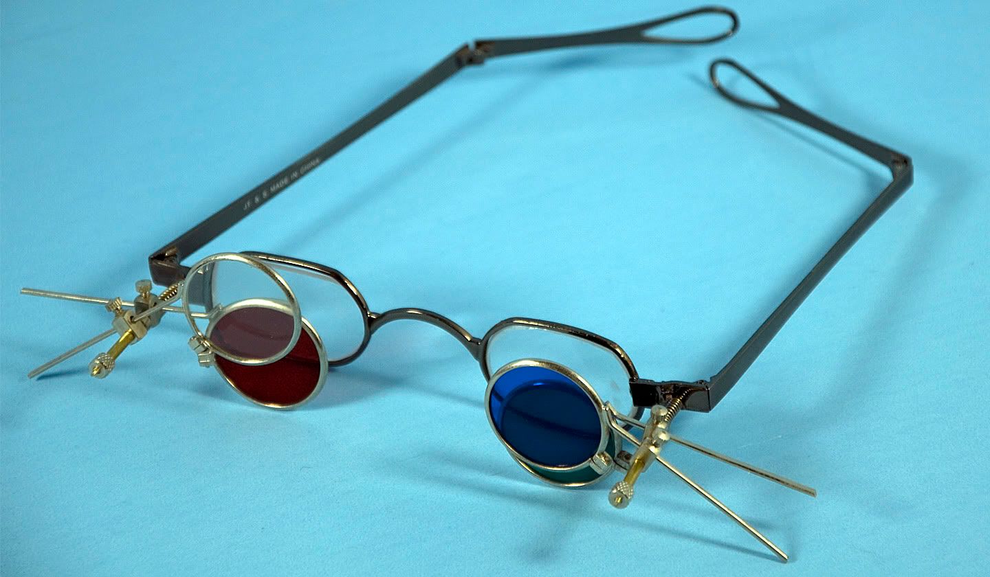
With all this in mind, I imagined the multifocal glasses in National Treasure where the characters could see different things depending on which lenses they flipped down. That led me to thinking that mental illness changes the way you see the world… and glasses correct your vision. I am in no way suggesting that wearing glasses helps mental illness, but I thought the connection made for a really interesting data visualisation.
And so, my assignment was born.

This is a button. Upon clicking it, an animation follows of a pair of glasses unfolding, turning and coming towards the viewer so that the sequence finishes as if the viewer is looking through the glasses.


The focus is then switched from the animation to looking through the lenses.

Buttons appear, the same for either lens so as to give the viewer total control over what they see.

I designed it this way so that it is easy to compare similar data. For example, in the left lens you might select ‘Lifetime Mental Disorder’ and ‘Health Risk Characteristics’ and in the right you might select ’12 Month Mental Disorder’ and ‘Health Risk Characteristics. Or you could choose completely different data to view in each lens.
Every time a button is selected, the rim goes a darker colour and an animation is triggered of a lens being flipped down from the side. This enables data to be overlaid and potential correlations discovered.


If the viewer started off with very general data and wanted to see a further breakdown, all they’d have to do is double-click on the lens which would take them through it to different pair of glasses and the desired data.


And even further..


To start with, I drew bar graphs by hand then took photos of them and edited them in Photoshop, but this process took so long and the results weren’t fantastic so I searched around for a website that would generate a graph for me. I eventually came across onlinecharttool which is great because it gives you a lot of choice in the appearance of your graph.
A bar graph, while a simple and clear way of showing 2 way information, didn’t look all that great through the glasses, and isn’t the most interesting way of displaying data. Plus I needed a type of graph that could potentially display more than two factors. So I explored onlinecharttool a little more and came across the ‘bubble graph’ which links back really nicely to one of Michael’s lectures. He spoke about particular characteristics that human beings were really good at determining and they include shape, colour and size, all of which are demonstrated more clearly in the bubble graph. This graph is also more abstract and easier to look at in terms of the glasses.
On another level, mental illness is such a varied thing and each person experiences it so differently so I really liked the fact that I was able to use several different shapes, colours and sizes to represent this. The size of the shape corresponds to the percent of people in the categories underneath. This type of graph has the potential to hold much more information as it is possible to choose the position of the shape on the graph.
One last thing I liked about this new graph was that when I saw the different sized shapes I automatically thought of perspective, which is not only something glasses can alter, but mental illness also. And on an abstract level, the triangles could be trees, the squares/rectangles buildings and the circles suns – some appearing further away than others due to perspective.
This assignment really stretched me conceptually. I am a very hands on/visual person, so usually when I design something, I build as I design, see how it looks as a work in progress, then make the necessary changes. In this case, I didn’t have the computer skills to create a real data visualisation, so ironically, I built my networked media assignment out of glue and paper. I designed the glasses, buttons, bits and bobs, cut them out of lovely paper, took photo’s of them, then edited them and put them all together on Photoshop.
Though I felt like ripping this assignment to shreds several times over, I feel a great sense of achievement in handing it in, and can see that it was a very worthwhile way to spend I’m not going to tell you how many hours.
My thanks to Sharon and Michael.
Data Visualisation (in progress)
May 13, 2010
fig 1
to my data visualisation assignment. The data set I ended up using was from the 2007 National Survey of Mental Health and Wellbeing. To activate the data visualisation, you click a link from a related website eg. Beyond Blue and a new screen will open up showing fig 1. Click ‘Welcome’ and an animation follows:
fig 2
The glasses unfold and turn around…

fig 3
… so it is as if the viewer is looking through the glasses. I chose to use glasses in this data visualisation because both glasses and mental illness change the way you see the world.
fig 4
The focus changes from the animation to the viewer looking through the lenses.

fig 5
Buttons appear, the same set for each lense so that the viewer has total control over the statistics they see.
fig 6
In this example, the viewer wants to see Family Composition vs 12 Month Mental Disorder statistics on the left, and on the right; Education vs 12 Month Mental Disorder. Having these graphs side by side allows for easy comparison of data.
Every time a button is selected it is darker. Click to select and click again to deselect. When a button is clicked an animation is triggered:


This project took a long time to conceptualise and is probably the assignment I struggled most with all semester. To start with I was very confused because I thought we were expected to actually make the data visualisation. With only a few weeks left and no flash lessons in our tutorials, I began to panic before being gently told that only the concept was necessary. I was slightly relieved, but I still felt quite lost because although I’d looked at lots of data visualisation examples, I didn’t feel like I had a grasp of what Flash or the other programs used were actually capable of building. I didn’t want to create an impossible assignment!
I thought a lot and struggled to come up with an exciting new way of illustrating data. I realised that the first step would be to acquire the data and build the visualisation to fit the particular data set instead of fitting the data to the visualisation. So I asked my dad if he had any statistics I could use. He gave me some educational data from the Solomon Islands which looked promising to start with. I was thinking along the lines of an area graph, such as this one from the NY Times. I really liked the way you could choose which data you viewed and how you could see the data move.
The actual graphs gave me a lot of trouble. I started my hand drawing them then taking a photo and editing on Photoshop, but the whole process took way too long, so I searched the internet for a program or website that would draw the graph for me. I came across onlinecharttool which is a great website that lets you make a lot of stylistic choices. Then you just type in your data and BAM:
(insert pic of graph)
I was initially delighted with the graph but the more I looked at it, the more the perspective seemed all wrong. And bar graphs are quite boring, so I played around with onlinecharttool some more and came across this graph:
Blue and Orange – in progress
May 10, 2010


:(
May 9, 2010
I’ve been so busy working, trying to meet the frickin youth allowance criteria, that I’ve only just gotten around to actually constructing a view of my datavis project. I played around trying to create it in photoshop, but it just looked crap so I think it’s back to good old paper, scissors and glue for now.
Multi-focal glasses
May 6, 2010
All is not lost.
I had an ‘oooooh, shit!’ moment last night when I read that we needed the complete dataset for our assignment. So I gave up on the Solomon Island education idea and moved into Mental Illness statistics. I spoke to Sharon in todays tutorial and she said that as long as I had enough data to demonstrate the visualisation it would be okay. She made me talk through my visualisation concept, which is still pretty sketchy, but basically, the screen would be divided into three:
(insert pic)
The top strip would be an index of the interview questions, and the rest of the screen would be divided in half with two graphs, starting out with very general statistics depending on which questions you’ve selected in the top. You then have the option of dragging the graphs over each other to compare the data or to double click on one of the graphs. Doing this will trigger an animation which will take you though the graph to view the data in more detail.
This all sounds really complicated and I wasn’t sure how I’d illustrate or demonstrate this, until Sharon suggested I illustrate the stack of graphs behind the initial ones, showing all the levels of detail available.
This made me picture the bifocal glasses in National Treasure, where it was possible to flip as many lenses down as you liked, with different combinations yielding different results.
Here is an example of the type of glasses I’m talking about. But obviously mine would have a lot more lenses. So for the sake of this blog, when I refer to ‘multi-focal glasses’ I’m not referring to modern glasses.
So the new idea is that there will be a big pair of mutli focal glasses centered in the screen and the little levers for the lenses on either side. (that you flick up and down to put the lenses up or down). At the top of the multi-focal glasses is another hinge so that ALL of the lenses are lined up (one circle instead of two).
Glasses could be linked to education and literacy, but I think I’ll use the mental illness data instead because having a mental illness could really change the way you view the world.
So that’s where my assignment stands at the moment.
It’s still a bit of a mess. Once I’ve come up with some concept drawings, I’ll post them and it should all make more sense.

